
![]()
Very cool map put together of the 297 most influential political websites and whadda ya know…Flopping Aces made it into the list. (h/t Hot Air)
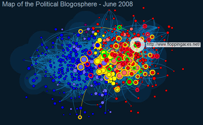
Apparently the size of the circle is the amount of inbound and outbound links. The area your circle is in relates to where your links come from. More conservative links and you go more right and vice versa.

See author page

Wow, why can’t I stop looking at this?
I say you belong higher, I mean where else can you get politics with a smile.
Uh… how can you tell, Curt. Altho *very* happy FA made “a map”. But is there a search function to see names? Because it’s like looking at MikeA’s “dizzy Obama” photo trying to find FA there!
_________________
UPDATE: Found the “search” function. Looks like FA and HuffPo are about equal in “influence”…. gasp! LOL
On the flip side, No Quarters doesn’t even register. No wonder their rumor mill isn’t making it to solid ground.
i think it looks kinda cool, whoever thought of doing that had a great imagination.
…or a digital sharpie, lots of time and even more drugs….
Poor Mike’s America… such a small speck of red so far off to the right it doesn’t even show up!
And since Mata H made the request….
Pretty neat. Do the up and down directions correspond to anything? Doesn’t seem like it (lewrockwell.com and amconmag, who are in fairly close agreement politically, end up on opposite sides).
I think that the color coding may have been done by hand. Also it seems to have some issues positioning blogs with few links – for example, http://www.becker-posner-blog.com is waaaayyy over on the right, even though it doesn’t seem particularly radical.
Other interesting points: look where http://www.mikehuckabee.com ended up. Also http://www.johnmccain.com. Huckabee is one of the farthest left of the ‘red’points – John McCain a little further right but not much. Compare the position of http://www.usmc.mil, way over on the right.