
![]()

By John Dee
Excess all cause death in heavily vaccinated nations is making global headlines. In this mini-series I derive a measure for excess COVID death.
I’m hoping the subtitle paints a clear picture of where I’m at and where I’m going with this series. Excess all cause death is soaring in the UK, across Europe and across the globe, so none of this is down to sheer coincidence or due to localised factors such as the aftermath of lockdown, ageing populations, closure of health services, poor diagnostics and so on. There is only one common factor linking excess young death with old across nations and continents and I’m pretty sure we can guess what this is. The elephant isn’t just in the room, it is standing on our toes and looking us in the eye. The response from the authorities and mainstream media is complacency and thin excuse, so we should expect more unnecessary deaths.
The Trampoline Of Excess
A common method for estimating excess death is to subtract a baseline value from observed counts on a daily, weekly or monthly basis. Providing the baseline is derived from historical values spanning five years or more, that can be said to be representative of a nation’s risk profile (i.e. nothing ‘funny’ going on), then we arrive at a set of robust figures for deaths over and above that expected, as well as under and below that expected.
Excess death is a queer time series in that a surge in excess is usually followed by a decline. Equally, a decline is usually followed by a surge. This is because people can only die once, and if they die early due to a circulating pathogen then their death cannot be recorded again at a later date.
Think of a child bouncing on a trampoline – if they jump up they must come down, and once they come down they’ll soon be going up again! When that child jumps gently they’ll bob up and down around a central value, being the height of the trampoline’s surface. If they suddenly surge up they’ll come down with a crash, this surge being analogous to the population being hit by a toxin or bug. All of us are on the trampoline of life-death and a decent health service and sound government policies will help stop people falling off before their time.
But What About COVID?
Excess all cause death is a doddle to estimate since we can look back over many years to produce 5-year or even 10-year baselines; but what about COVID death? In the UK we can’t look back before January 2020 because SARS-COV-2 wasn’t circulating; all we have is 34 months of data at best, so what to do?
At these times we can resort to brewing a cuppa, opening the biscuit tin and wearing a hat that brings inspiration. It is under these conditions that I realised disease prevalence could serve as a baseline for estimating excess COVID death. Think of this as deriving a rate for COVID deaths per degree of national infection. Get the kettle on and have a squizz at this…
A Recipe
In Hunting For Vaccine Benefit (part 2) I introduced subscribers to a variable called ‘Case Detection Rate’ (CDR) with the following paragraph:Sensible types will appreciate that case counts will rise and fall with the level of viral testing undertaken across the nation. Statistically-speaking test activity is a potential confounding factor in the analyses of raw counts made so far and so these were repeated using the rate variable of COVID cases per 100 viral tests. This variable may be thought of as a case detection rate but I also like to think of it as a rough proxy for case density (a.k.a. disease prevalence).
This has been a handy construct in my examination of data, especially in time series and other forms of modelling where it soaked up variance due to the virus running amok. Certified COVID death should be self-explanatory, the official definition of which may be found here.
As Two Time Series
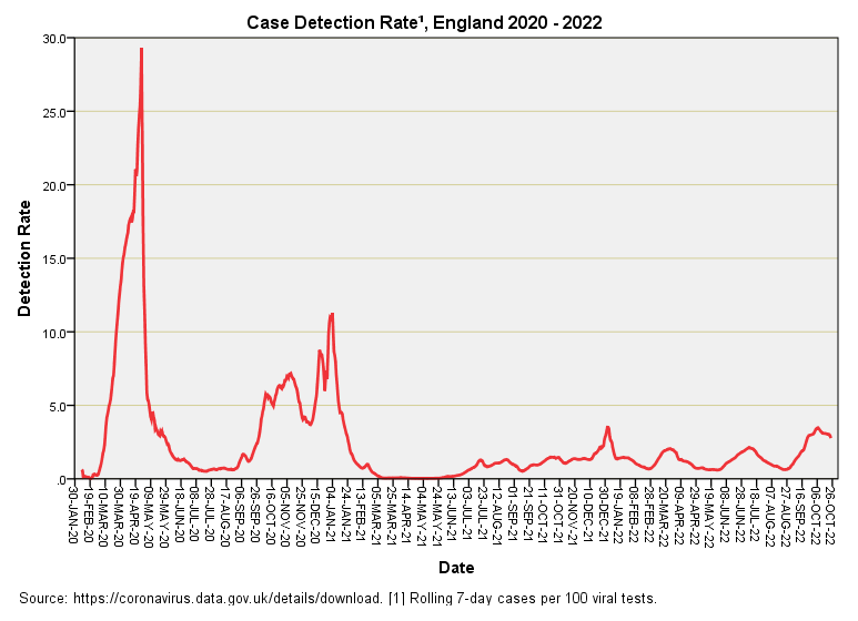
Let us start with a time series plot for CDR:
Note the footnote that states ‘derived from rolling 7-day counts’ this little trick is a favourite of the Office for National Statistics (ONS) since rolling 7-day counts iron out the strong weekly pattern of viral testing that otherwise introduces a lot of administrative noise.
As explained elsewhere the first big spike is driven by in-hospital testing of the first few cases and so is heavily biased. Mass testing of the nation was well underway come the second and third spikes and these offer better estimates of disease prevalence. The persistent ramp of low-level case detection from June 2021 is something of a curiosity given the vaccines were supposed to be efficacious, though we have all since learned from the lips of a Pfizer director before the EU parliament that the mRNA jabs were never tested for ability to reduce transmission. This should not have come as a surprise to anybody who stopped to consider how a mRNA jab actually works.
The time series for certified COVID deaths should also be familiar:
Two big peaks and that’s yer lot. Pandemic over. From June 2021 onward we seem to have slipped into endemic territory, and I am surprised at the lack of a 2021/22 winter season peak for what is supposed to be a member of the coronavirus family. I suspect old-fashioned influenza made a come back and crowded the weaker COVID strains out – a Darwinian theory on the micro scale that totally fascinates.
As A Scatterplot
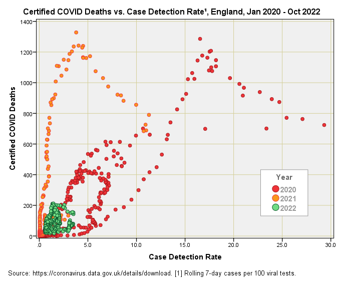
You can’t beat a colourful scatterplot for cogitating on the deep relationship between two variables, so this is what we have here:
There are a fair few features to consider in this fascinating data cloud. We might start be contemplating the massive difference between years, with 2022 yielding a rather pathetic pudding of points in the bottom left-hand corner indicating there is very little, if any, relationship between COVID death and CDR for this year. This is not a small point for the implications are great, ranging from possible evidence of vaccine benefit through to evidence of mild strains that don’t lead to severe COVID-19 and death. These are two mighty confounding factors that the pro-mRNA lobby often fail to appreciate and account for in their analyses.
The signature ‘V’ patterns for 2020 and 2021 are remarkably similar, with the ‘V’ for 2021 simply slid along to the left indicating the same underlying dynamic but at lower levels of disease prevalence. We might jump to the conclusion of more deaths for less disease but the wrinkle here is that the CDR for 2020 started out as PCR testing of a handful of sick inpatients which greatly skews the points to the right. In all likelihood if we adjusted the data for this considerable bias the red splatter might well coincide with the orange splatter, and a clue to this possibility is given by the similarly-shaped data clouds.
What, then, of that inverted ‘V’ shape that suggests an optimal level of infection for inducing death! I suspect this is an illusion brought about by a swing from testing sick inpatients under the pillar 1 scheme to testing more of the general population under pillar 2 of the national scheme; that is to say the base sample will be changing both in size and in nature over time. Obtaining a ‘pure’ picture of the situation is going to be tricky if not impossible with data that are publicly available. What we are missing is a pinch of time.
Adding Time To The Pot
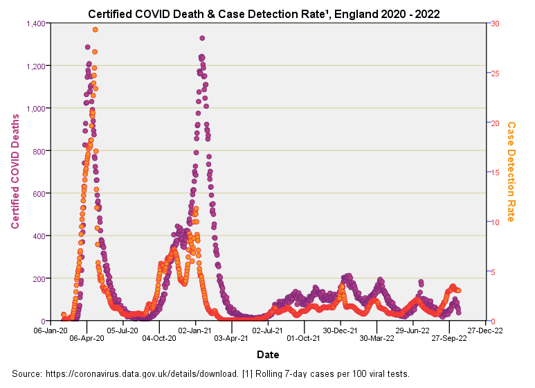
Let’s put time back into the equation and have a look at certified deaths and CDR together:
Now there’s a decent correlation right there (r = 0.688, p<0.001, n=987). During the first wave the pattern for incidence of certified death closely matches the pattern for CDR1, whereas during the second wave death eventually storms ahead of CDR, which remains low. This is intriguing for after January 2021 we see far more certified COVID death than we would expect from a consideration of disease prevalence, and this coming at a time when viral strains were getting weaker.
We may examine this relationship further by deriving the ratio of certified deaths to CDR and plotting this as a function of time. I shall present this result in the next article for it packs a punch!


I feel sorry for so many people who felt coerced into getting jabs.
Peer pressure got my neighbor who is now so ill that (at 43) her mother (at 62) had to move in with her to take care of her.
Medical mandates forced my doctor to get three jabs,
But she became so ill after that 3rd that she refused to get the 4th and they forced her into early (late forties) retirement.
An ex-neighbor who got married and moved away had gained 4 stepchildren then had two more children.
Covid came and they all got the jabs, 1, 2, 3, &4 because hubby was in the military.
Now one of them is dead, her most recent pregnancy ended in a spontaneous abortion and another of her older stepsons has myocarditis.
The stepchild who died is an “excess death.”
If my neighbor dies, it will also be an excess death.
If my ex-doctor dies, it will also be an excess death.
The WEF is led by elites who insist the world would be better off with far fewer people.
Are the jab’s excess deaths a feature, or a bug?
Heart disease and infertility are huge moneymakers for Big Pharma and Big medicine.